Every form is a conversion test
The form on the landing page is not a form. It is a conversion test that happens to look like a form. Each field is a vote against completion. Each error is a vote against trust. Each submit click is the user betting their attention on whatever comes next.
Most teams design forms for the data they want to collect. The teams that win design forms for the data they will actually use this week. The difference shows up in every metric that follows.
Fewer fields, every time
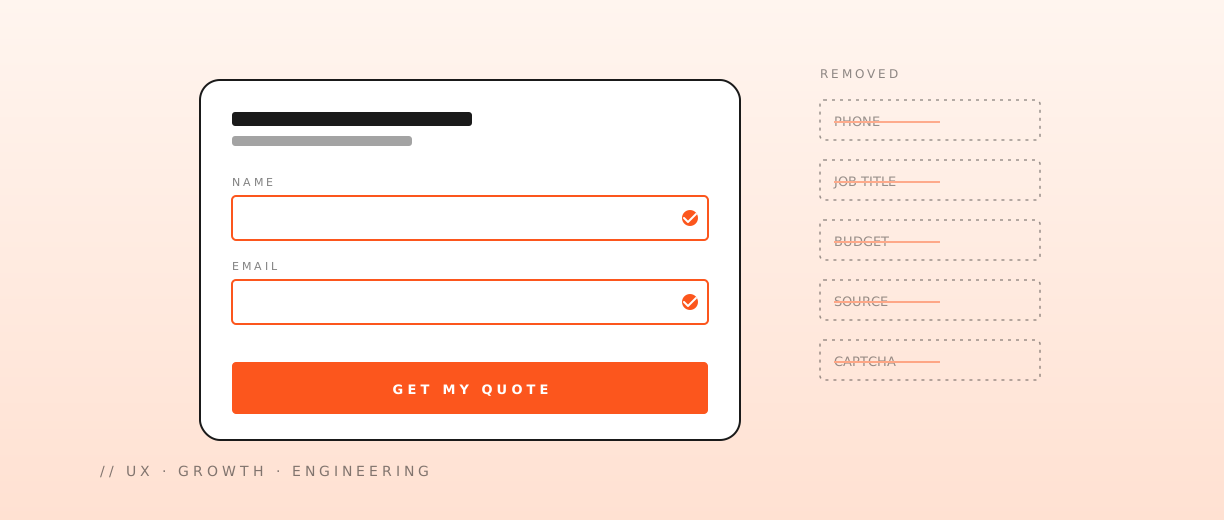
Every field is a chance for the user to close the tab. Ask only what you need to act today. The "we might want it for the CRM later" reflex kills more conversions than any layout choice. Collect the rest after the relationship starts.
The honest test for each field: if I removed this field, would the team still be able to do the next step? If the answer is yes, remove it.
A typical contact form audit:
| Field | Keep? | Why |
|---|---|---|
| Name | ✓ | Personalization, address |
| ✓ | The whole point | |
| Message | ✓ | Context to triage |
| Company | ? | Only if it routes the message |
| Phone | ✗ | Add as optional, never required up front |
| Role / title | ✗ | Ask in the follow-up |
| Budget | ✗ | Salespeople hate the answer either way |
| Source ("how did you...") | ✗ | Use analytics, not a survey |
| Marketing consent | ✓ | One checkbox, defaulted off |
Every "?" is a conversation with the team. Every "✗" needs justification to put back.
Errors should arrive late
Validate on submit, not on blur. The blur-validation pattern punishes the user for typing in the order they wanted to, fires errors before the user is done, and trains them to ignore the validation entirely.
The exception is fields where the format genuinely matters (email, card number) — and even those should warn gently, not refuse to continue. The pattern that holds up:
- On change: nothing.
- On blur: a subtle hint if the field is clearly invalid (e.g. an email with no
@). Never red, never aggressive. - On submit: the full validation pass, with all errors shown at once, with focus moved to the first error.
A form that screams at the user as they type loses conversions. A form that lets the user finish their thought and only then explains what to fix earns trust.
The submit button is a contract
A submit button that says "Send" makes no promise. One that says "Get my quote in 24 hours" tells the user exactly what they bought with their data. Conversion is downstream of clarity.
The pattern:
- The button text is the outcome, not the action.
- The button colour is the brand's primary CTA colour, not a button-coloured button.
- The button is wide enough on mobile that the thumb can hit it without looking.
- The disabled state during submission has its own copy ("Sending..."), not a spinner with no context.
A small thing. Worth more than half the A/B tests you will run on copy this quarter.
Layout that does not fight the user
The form is a flow, not a grid. The patterns that work:
- One field per row on mobile. Two columns are a fancy way to test how patient your users are.
- Labels above fields, not inside them as placeholders that disappear.
- Group related fields with whitespace, not boxes.
- A clear progress indicator if the form has more than one step.
- The submit button visible without scrolling once the form is filled.
The patterns that look smart and do not work:
- Floating labels that hide what the user just typed.
- Multi-step forms with no progress indicator.
- Conditional fields that pop in and out as the user types.
- A captcha placed between the last field and the submit button.
Honeypots, captchas, and the price of trust
Bot defense is a real cost — but a visible captcha is the most expensive form of it, and the one that costs the most in conversion. The full toolbox, in order of preference:
- Honeypot field. Free, invisible to humans, eliminates the cheapest bots. The first defense, on every form.
- Time-on-page heuristic. A real user takes seconds to fill a form, not milliseconds. Submissions that happen too fast are bots.
- Field-fill heuristic. Real users tab, click, sometimes paste. Bots fill every field at once. A submission with no input events is suspicious.
- Invisible reCAPTCHA v3. A score-based assessment, no user interaction. Solid for the next tier of automation.
- Server-side rate limiting. The last line, and the most reliable. Per-IP, per-email, per-account.
A visible captcha is a tax on your real customers. Add it only when the cheaper signals have failed. Most sites can run with no visible captcha at all and never lose to bots — they just need the layers above to be in place.
What good looks like under the hood
The engineering you do not see, but the user feels:
- Submit handled with optimistic UI — show the success state immediately, retry in the background if needed.
- The endpoint is idempotent. A double-click does not create two submissions.
- Server-side validation matches the client-side rules exactly. No surprises after submit.
- Errors from the backend are mapped back to the right field. "Invalid email" highlights the email field, not the form.
- The form recovers state on a network error. The user does not lose what they typed.
- Submissions are logged with enough context to debug a failed flow.
Each of these is invisible in the happy path. Each of them is the difference between a form that quietly works and one that loses a customer to a 500.
The thank-you page is the form
The page the user lands on after submit is not a confirmation — it is the first impression of the relationship. Three things it should do:
- Confirm that the submission was received, in plain language.
- Tell the user what happens next, with a real timeline.
- Give the user one small action to take — a calendar link, a doc to read, a video to watch.
Most "thank you" pages do the first and skip the other two. The teams that get the page right convert support tickets ("did my form go through?") into engagement.
Anti-patterns we still find in audits
The greatest hits, ordered by how often we see them:
- Required fields with no asterisk or visible indicator.
- A captcha that takes longer than the form did.
- A form that resets all fields on a validation error.
- A submit button that visually says "disabled" but is actually live.
- A "tab" key that skips past the submit button to an unrelated link.
- A success state that is just a green banner on the same page — no clear next step.
- An autofocus that fights the user's scroll position on load.
Every one of these costs conversions. Every one is a one-line fix.
A friction audit you can run today
A 30-minute pass on any form:
- Try to complete it in 30 seconds. If you cannot, the user will not.
- Try to complete it on mobile, one-handed, with poor signal. If it breaks, half your traffic just left.
- Try to break it. Type weird characters, paste a 5,000-character message, leave fields blank. The errors should be helpful.
- Submit, then click back. The form should remember what you typed.
- Open the analytics. Can you see which field caused the drop-off? If not, the data layer is the next project.
Forms reward small, disciplined work. The team that runs this audit every quarter will out-convert the team that ships a redesign every six months.
 Similar news